The brief
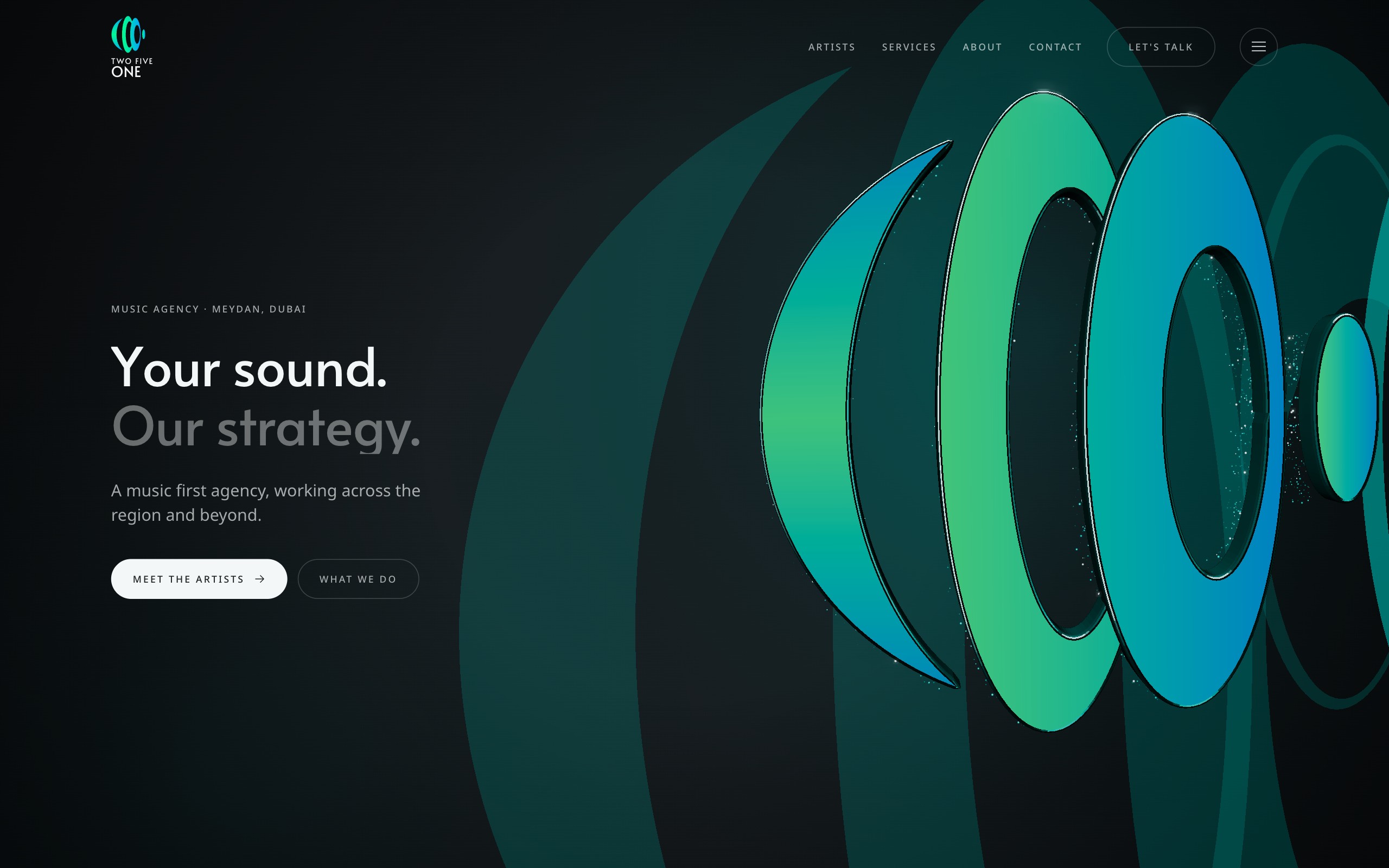
The rule from the agency was strict and good: nothing that was not theirs. No stock motifs, no colour casts over the artists, no decoration for its own sake. The brand had to carry the whole thing.
That meant the mark could not just sit in a corner. It had to become the world the site lives in.
What we built
A 3D soundwave built from the label mark anchors the site, and a wave motif runs through every section so the whole page feels like one instrument.
The artists appear on a helix roster in their own real colour, exactly as the agency asked, and the motion stays brand-first from the first scroll to the last.
- Brand site design and build
- 3D soundwave mark
- Wave motif carried through every section
- Helix roster of artists in real colour
Stack
- Three.js
- GSAP
- JavaScript
- Vercel